|
|
 |
« on: January 14, 2006, 11:05:10 AM » |
|
Here's what I have in mind for the Tyranids HUD. 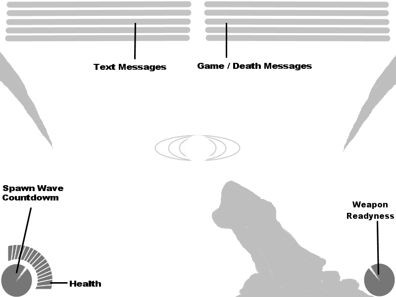 As you cna see it's very much simpler than the Imperial HUD, due to the fact they dont need to switch weapons or worry about ammo and clips. I'm still in two minds about the wave countdoen and weapon readyness indicators, the clock face style doesnt feel very organic to me. Prehaps I could use a style like a flower blooming instead. Any ideas? Another concept was to control all the tyranids from a 3rd person P.O.V. how do you guys feel about that idea? |
|
|
|
|
 Logged
|
|
|
|
|
|
|
|
« Reply #1 on: January 14, 2006, 11:22:45 AM » |
|
the hud seems pretty clean and usable.
As flowers... uhm. Why not a simple, "growing" vertical bar?
As for the third person pov, I'd put it into optional, so if you can choose to use it or not.
|
|
|
|
|
Logged
|
ver vigilant!
|
|
|
|
|
|
|
« Reply #2 on: January 14, 2006, 11:50:39 AM » |
|
Vertical bars are even less organic than clocks. I was aiming for something with a cyclic feel too. Another idea was a fan effect of scales.
One of the reasons for the 3rd person idea was to save the team form having to make high detail weapon models for the 1st person view, which wont work if it need to be optional.
|
|
|
|
|
Logged
|
|
|
|
|
|
|
|
« Reply #3 on: January 14, 2006, 01:42:11 PM » |
|
Why not have the weapon readiness shown on the weapon model itself?
It could be spines or spikes on the weapon rising from a flat to upright position for example.
3rd person would probably be good for melee combat. But its a bitch for aiming ranged weapons. Make it togglable ingame.
|
|
|
|
|
Logged
|
|
|
|
|
|
|
|
« Reply #4 on: January 14, 2006, 01:55:51 PM » |
|
I did consider having a long firing animation, where it reloads iself, but fluff-wise all the action is internal, so I concluded that the nids would have some kind of instinctive understanding of the weapon's state, which the readyness indicator represents.
|
|
|
|
|
Logged
|
|
|
|
|
|
|
|
« Reply #5 on: January 14, 2006, 04:23:34 PM » |
|
yeah, I agree.
what about a circle that starts "growing" from the center to represent the weapon readyness?
|
|
|
|
|
Logged
|
ver vigilant!
|
|
|
|
|
|
|
« Reply #6 on: January 14, 2006, 04:42:46 PM » |
|
weapon readyness:
how about somekind of "organic bubble" where somekind of liquid is sparking (<- thats the right word?). Everytime you shoot some gets sucked through some kind of vein? and with time its growing fuller again?
spawnwave counter:
dont really know... maybe they feel the next waves... maybe just an eye like on the weapons thats opens slowly and if its opened fully the next spawnwave is there.. then it close again...
and just a suggestion about the nid weapons:
is there going to be some kind of second fire modus? because it would be cool if you could aim through the eye of the weapon. like seeing almost third of the screen only weapon but you can aim better?
|
|
|
|
|
Logged
|
|
|
|
|
|
|
|
« Reply #7 on: January 14, 2006, 05:05:23 PM » |
|
The counter ideas arent bad, i'll think about it.
Many of the nid weapons will be comination weapons, like in RS where you have a pistol in one hand and a knife in the other. Primary attack fires the gun, secondary attack triggers the melee attack. So that's probably a no to the weapon's eye view.
|
|
|
|
|
Logged
|
|
|
|
|
|
|
|
« Reply #8 on: January 14, 2006, 07:42:18 PM » |
|
cannot it be something more organic? like the HUD for the Alien in AVP multiplayer? it had a long horisontal bar that faded shrunk and faded as the player lost health. that could be used as ammo counters, just bars that fade away and shrink as the player uses up all ammo. also, i think all text should be held at a minimum. symbols and colours could be used to describe things. of course, the players could still chat with each other, cant take away that text  Edit: i love the flower idea |
|
|
|
|
Logged
|
|
|
|
|
|
|
|
« Reply #9 on: January 14, 2006, 08:40:43 PM » |
|
I played AVP, if anything I found the health blur to be too subtle for my tastes. Was that just me?
|
|
|
|
|
Logged
|
|
|
|
|
|
|
|
« Reply #10 on: January 14, 2006, 09:34:18 PM » |
|
no, i felt that too. It was too vague as to how much health you had left.
It can still look organic with a bar fill system, some sort of coloured liquid in a organic containter.
|
|
|
|
|
Logged
|
God of the outer darkness. bringer of evil, storms, plague, misery, and torment. Protects fugitives, Apparently...
|
|
|
|
|
|
|
« Reply #11 on: January 15, 2006, 06:18:02 PM » |
|
Hi guys, it seems there is a public internet computer here.  So I'll stay in touch, it don't have IRC though. These are nice ideas. I think the most important thing is that you know exactly how much health you have, weapons is more like - if it don't fire, wait some more. But for the weapon readyness indicator it would be cool if there were different indicators for different weapons, all based on filling an organic canister with ammo. You shoot acid? Fill it with acid. Living ammunition? Fill it with beetles. Or spines in the spinefist. The health bar could be a blood canister that empties, as you loose health. Not very original, but easy to monitor. I don't know what the wave-monitor should look like, or if it should even be there. I guess anything organic would do. It would also be cool if the zoom in-effect was to change view to the weapon. We would just need to put that function on the keyboard instead of the mouse, as two buttons are already in use for meelee and ranged attacks. And the third-person view would definately come in handy in close-combat. It's very annoying to loose the overview once you get stuck in close-combat. |
|
|
|
|
Logged
|
f this is a dream...
My subconscious has a sick sense of humor.
|
|
|
|
|
|
|
« Reply #12 on: February 08, 2006, 04:20:04 PM » |
|
I suggest no health bar but instead some sort of Glare around the middle of the hud to represent bleeding
|
|
|
|
|
Logged
|
URL=http://imageshack.us]  [/URL] |
|
|
|
|
|
|
« Reply #13 on: March 06, 2006, 01:35:25 AM » |
|
Well here is my design  The colours are not final just to make things alittle easier for the you guys, Bhe blue represents the eventual colour and shades that the design will take. The Oranage represent "Black Ichor" which i have read time to time in thing related to Tyranids, now it acts as a health bar the more faster it is pumping the healther you are, so for example you get hit and you get pretty screwed up the bar is going to slow down now the speeds haven't been worked out as of yet. I am also currently working on a idea for ammo instead of a bar like in NS where you can only use so much and it recharges as you loss it, i was thinking more like you see a picture of a gland with some weird looking liquid in it which is representing how much you can shot say a deathspitter or any other weapon. Now when you fire and say you only have ten shots it goes down and down until it is empty, then the player has to wait for it to be "refilled" as the tyranids body produce more and pumps it into the gland. P.S: Sorry about the little orange "smug" just wanted to get the basic idea of it and i will improve on the design. |
|
|
|
|
Logged
|
URL=http://imageshack.us] [/URL] |
|
|
|
|
|
|
« Reply #14 on: March 06, 2006, 09:12:41 AM » |
|
Interesting. Animation speed as an indicatior, very analouge. I hadn't thought of that. Do you think it might get distracting?
|
|
|
|
|
Logged
|
|
|
|
|
|
