|
|
 |
« on: December 04, 2005, 12:44:45 PM » |
|
I'm trying to plan ahead for the marine's HUD. Here's what i've come up with so far : 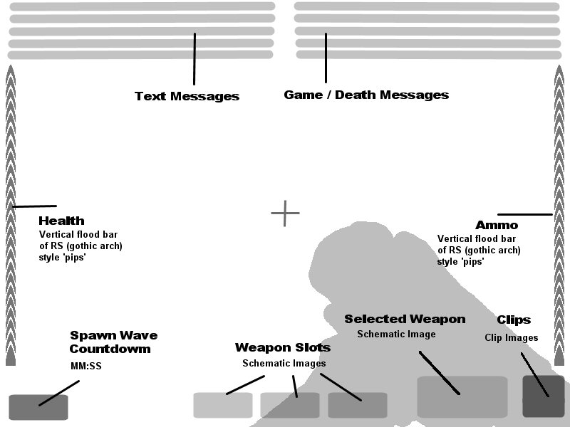 it's just a vey rough mockup so far. Personally I think it's taking up too much screen space. What do you think? Feel free to post your own HUD mockups. |
|
|
|
|
 Logged
|
|
|
|
|
|
|
|
« Reply #1 on: December 04, 2005, 04:19:03 PM » |
|
you could make it so you can choose what you want displayed. Maybe you could use the + and - keys. +adds more of the HUD -Reduces the amount.
|
|
|
|
|
Logged
|
=][= Ordo Xenos, first clan for RS and RS2
To be Unclean, That is the Mark of the Xenos
To be Impure, That is the Mark of the Xenos
To be Abhorred, That is the Mark of the Xenos
To be Reviled, That is the Mark of the Xenos
|
|
|
|
|
|
|
« Reply #2 on: December 04, 2005, 05:17:30 PM » |
|
That's doable. How many steps do you think it would need? What elements would you have at each step?
|
|
|
|
|
Logged
|
|
|
|
|
|
|
|
« Reply #3 on: December 04, 2005, 07:09:12 PM » |
|
personally this frame style hud makes me feel clostraphobic and clutters up the screen. personally i would perfer to see a much more simplified one that doesnt get in the way
|
|
|
|
|
Logged
|
|
|
|
|
|
|
|
« Reply #4 on: December 04, 2005, 10:12:23 PM » |
|
yea there is too much hud, games with alot of hud tend to put me of playing them, u cud have the text emssages pop up in hte middle of ur screen and have the kills/deaths the same as RS1 & maybe have the vertical flood br for health and ammo smaller and together on the elft hand side (left hand side because fun will take up the right side)
|
|
|
|
|
Logged
|
img]http://img.photobucket.com/albums/v688/benny14/866567587.jpg[/img]
"Remember the First!"
|
|
|
|
|
|
|
« Reply #5 on: December 04, 2005, 10:19:26 PM » |
|
I've updated the mockup to reflect Raz's feedback. The plan is for the light grey areas to fade in/out depending if they are in-use or not.
|
|
|
|
|
Logged
|
|
|
|
|
|
|
|
« Reply #6 on: December 05, 2005, 12:05:04 AM » |
|
thats alot better
|
|
|
|
|
Logged
|
img]http://img.photobucket.com/albums/v688/benny14/866567587.jpg[/img]
"Remember the First!"
|
|
|
|
|
|
|
« Reply #7 on: December 05, 2005, 01:23:13 PM » |
|
personally im not found of anything being in the middle portion of the screen. I would rather see them put out of the way at the bottom of the screen as not to obscure the side of the screen and what may be a incoming nasty.
|
|
|
|
|
Logged
|
God of the outer darkness. bringer of evil, storms, plague, misery, and torment. Protects fugitives, Apparently...
|
|
|
|
|
|
|
« Reply #8 on: December 05, 2005, 06:06:05 PM » |
|
You could make some of it semi transparant maybe
|
|
|
|
|
Logged
|
=][= Ordo Xenos, first clan for RS and RS2
To be Unclean, That is the Mark of the Xenos
To be Impure, That is the Mark of the Xenos
To be Abhorred, That is the Mark of the Xenos
To be Reviled, That is the Mark of the Xenos
|
|
|
|
|
|
|
« Reply #9 on: December 06, 2005, 09:57:37 AM » |
|
Hmm nice concept but this for a marine or a guardsmen cause if it is a Marine maybe u should have it more of a helment HDD
|
|
|
|
|
Logged
|
URL=http://imageshack.us]  [/URL] |
|
|
|
|
|
|
« Reply #10 on: December 06, 2005, 11:15:17 AM » |
|
Hmm nice concept but this for a marine or a guardsmen cause if it is a Marine maybe u should have it more of a helment HDD What might that look like? |
|
|
|
|
Logged
|
|
|
|
|
Nic2
Beta [Kraken]
Guardsman

Posts: 16


|
|
« Reply #11 on: December 06, 2005, 03:31:45 PM » |
|
Yeah.. for a marine you could make the inside of the helmet visible and draw the hud on that.. That way it will be more realistic cos all the info is on the helmet  I think they have it like that in starwars republic commando, very niceley done imo. To the "text in the center of screen" thing... I say, NO WAY!!! Never ever! |
|
|
|
|
Logged
|
|
|
|
|
|
|
|
« Reply #12 on: December 06, 2005, 04:38:21 PM » |
|
My original concept had a visor-like frame around it, I would agree with Raz that felt rather restrictive.
As for centre text, I dont want anything getting between me and my target :twisted:
|
|
|
|
|
Logged
|
|
|
|
|
|
|
|
« Reply #13 on: December 06, 2005, 05:43:29 PM » |
|
New concept 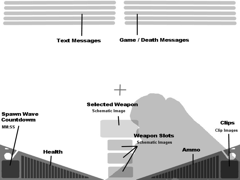 |
|
|
|
|
Logged
|
|
|
|
|
|
|
|
« Reply #14 on: December 06, 2005, 06:06:15 PM » |
|
Hm, that looks a bit to cluttered. less the weapon select menu only appears when you scroll through weapons.
|
|
|
|
|
Logged
|
=][= Ordo Xenos, first clan for RS and RS2
To be Unclean, That is the Mark of the Xenos
To be Impure, That is the Mark of the Xenos
To be Abhorred, That is the Mark of the Xenos
To be Reviled, That is the Mark of the Xenos
|
|
|
|
|
